In many reporting workflows, it’s helpful to send reports straight from a spreadsheet, complete with a chart inside the email. Imagine you’re running a surf shop with branches in different cities. Every week, the managers are waiting for their sales report: you filter the data for Sydney, copy the chart, paste it into an email, then repeat the same steps for Byron Bay and the Gold Coast. Before long, it feels like you’re stuck doing the same routine again and again.
Instead of preparing these reports by hand, the whole process can be automated. With a little help from Google Apps Script, the spreadsheet can filter the data for each city, update the chart, and send the report by email automatically.
In this tutorial, we will see how to:
- Extract a list of unique cities from the sales data.
- Apply a pivot filter dynamically for each city.
- Capture the chart as an image.
- Send a nicely formatted email with the chart embedded directly in the body.
We’ll go through the script function by function.
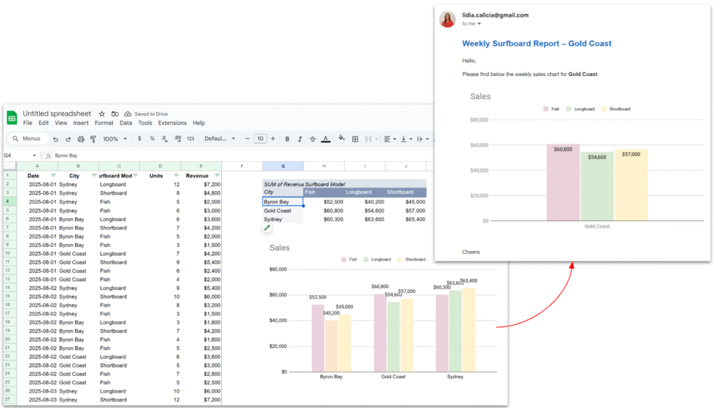
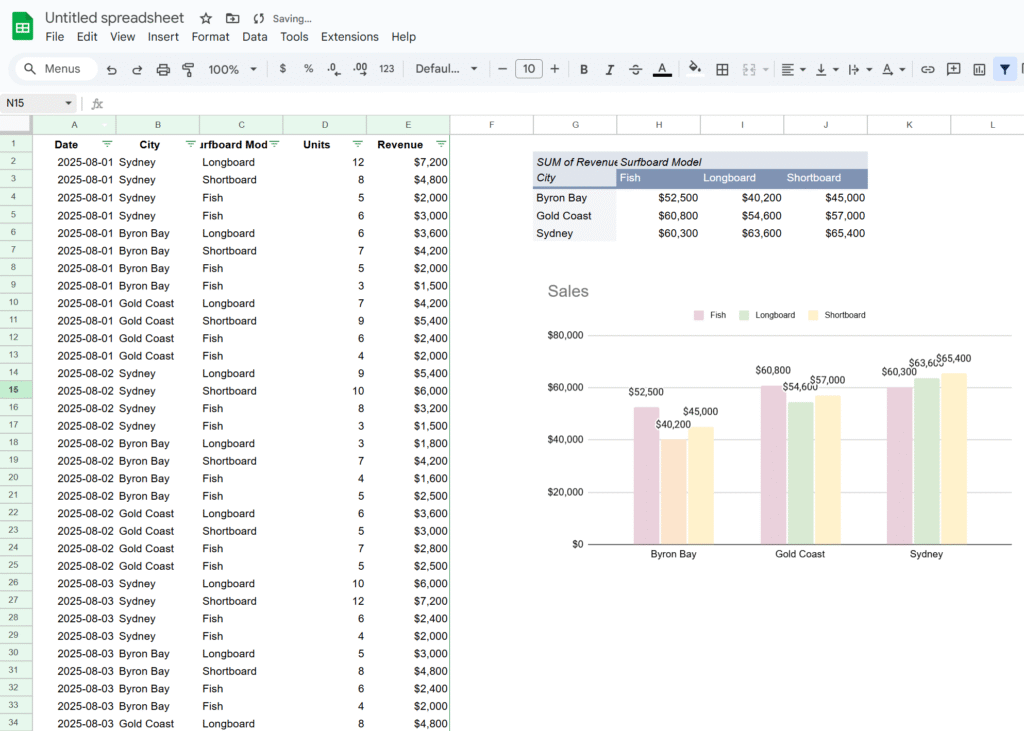
Here’s the Google Sheet we’ll be using in this tutorial, containing a simple dataset along with a pivot table and a chart.
1. Main function – looping through cities
Our entry point is the sendWeeklyReports() function.
function sendWeeklyReports() {
  // Getting sheet and data
  const ss = SpreadsheetApp.getActiveSpreadsheet();
  const salesSheet = ss.getSheetByName("Sales");
  const salesData = salesSheet.getDataRange().getValues();
  const headers = salesData.shift();

  // Extract cities
  const cities = salesData.map(x => x[headers.indexOf("City")]);

  // Get unique list of cities
  const unqiueCities = new Set(cities);

  // Get pivot table
  const pivotTable = salesSheet.getPivotTables()[0];

  // Get chart
  const chart = salesSheet.getCharts()[0];

  unqiueCities.forEach(city => {
    applyPivotFilter(city, pivotTable);
    const chartBlob = getPivotChartAsImage(chart, city);
    sendEmailReport(city, chartBlob);
  });
}Explanation:
- We grab the entire dataset from the Sales sheet.
- From the data, we extract all values in the City column and convert them into a Set → this gives us a unique list of cities. This way, if a new city is added in the future (e.g. Melbourne), it’s automatically included.
- We grab the pivot table and chart already created in the sheet.
- Finally, we loop through each city, apply a filter, generate the chart image, and send the email.
This main function orchestrates the entire workflow.
2. Filtering the Pivot Table
We need to update the pivot table filter so that it only shows results for one city at a time.
function applyPivotFilter(city, pivotTable) {
  // Remove existing filter
  pivotTable.getFilters().forEach(f => f.remove());

  // Create a criteria for the city
  const criteria = SpreadsheetApp.newFilterCriteria().whenTextContains(city);
  pivotTable.addFilter(2, criteria);

  SpreadsheetApp.flush();
}Explanation:
- First, we clear existing filters. This ensures we don’t stack multiple filters and accidentally hide everything.
- Then, we create a new filter criteria for the city.
- The
addFilter(2, criteria)call means “apply this filter on column index 2” (update this index if your “City” column is different). - Finally, we call
SpreadsheetApp.flush()to force Sheets to update the pivot table immediately before we grab the chart.
This function makes the pivot behave as if you clicked the filter dropdown manually and selected just one city.
3. Exporting the Chart as an Image
Once the pivot table is filtered, the chart updates automatically.
We can then capture it as an image Blob.
function getPivotChartAsImage(chart, city) {
  return chart.getAs("image/png").setName(`Sales_${city}.png`);
}Explanation:
chart.getAs("image/png")converts the chart object into an image blob.- We rename the file with the city name, which is handy if you want to attach it or archive it.
This blob can be sent in an email, saved to Drive, or inserted into a Slide deck.
4. Sending the Email
Finally, we embed the chart directly in an HTML email body.
function sendEmailReport(city, chartBlob) {
  const recipient = "manager@example.com";
  const subject = `Weekly Surfboard Report – ${city}`;

  const htmlBody = `
    <div style="font-family:Arial, sans-serif; color:#333;">
      <h2 style="color:#1565c0;">Weekly Surfboard Report – ${city}</h2>
      <p>Hello,</p>
      <p>Please find below the weekly sales chart for <b>${city}</b>:</p>
      <img src="cid:chartImage">
      <p style="margin-top:20px;">Cheers,<br>Your Automation Bot 🤖</p>
    </div>
  `;

  GmailApp.sendEmail(recipient, subject, "See the HTML version", {
    htmlBody: htmlBody,
    inlineImages: {
      chartImage: chartBlob
    }
  });
}Explanation:
- The
htmlBodycontains a nicely styled email. <img src="cid:chartImage">is a placeholder that’s replaced by the inline chart image.- In the
sendEmailcall, we pass both the HTML body andinlineImages: { chartImage: chartBlob }. - Result → the chart is embedded in the email itself, not just attached.
This makes the report feel polished and professional.

In conclusion, this workflow shows how easy it is to turn a manual reporting routine into a smooth, automated process. By letting Apps Script filter the pivot table, capture the chart, and send it directly inside an email, you get consistent weekly updates without lifting a finger. It’s a small piece of automation that saves time, reduces errors, and keeps your reports looking professional.