Have you ever noticed that chart colors in Google Sheets sometimes shuffle around when your data changes? This usually happens when you build a chart on top of a pivot table. If one of the series (like a product or category) isn’t present in the filtered data, Google Sheets automatically re-assigns colors.
The result: one week “Surf Wax” is blue, the next week it’s orange, and your report suddenly looks inconsistent. Not great if you’re sending charts to clients or managers who expect a clean, consistent palette.
In this tutorial, we’ll fix the problem once and for all by locking chart colors using the Google Sheets API from Apps Script.
Why the colors shuffle
Charts in Google Sheets don’t store colors per label by default, they store them per series position. So if your chart shows [Surf Wax, Leash, Wetsuit] this week, those get assigned colors 0, 1, 2. But if next week [Pad] is missing, everything shifts left and the colors move with them.
That’s why you see colors “jump” around when some categories are empty.
The fix: define your own color map
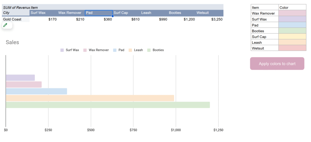
The solution is to create a color map table in your sheet that tells Apps Script what color each item should always use.
Example in range P2:Q:
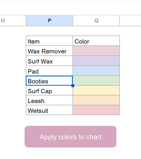
The trick is that we don’t actually use the text in the “Color” column, we use the cell background color. This makes it easy to set and change colors visually.
Using the Sheets API to lock colors
The built-in SpreadsheetApp class in Apps Script doesn’t let us fully control chart series. For that, we need the Advanced Sheets Service (a wrapper around the Google Sheets REST API).
To enable it:
- In the Apps Script editor, go to Services > Add a service > turn on Google Sheets API v4.
The Apps Script solution
Here’s the script that applies your custom colors to the first chart on the Sales sheet:
/**
 * Apply chart colors from mapping in P2:Q to the first chart in "Sales".
 */
function updateChartColors() {
  const ss = SpreadsheetApp.getActiveSpreadsheet();
  const sheet = ss.getSheetByName("Sales");
  const spreadsheetId = ss.getId();

  // 1. Build color map (Item -> hex from background)
  const mapRange = sheet.getRange("P2:Q");
  const values = mapRange.getValues();
  const bgs = mapRange.getBackgrounds();

  const colorMap = {};
  values.forEach((row, i) => {
    const item = row[0];
    const color = bgs[i][1];
    if (item && color && color !== "#ffffff") {
      colorMap[item] = color;
    }
  });

  // 2. Get chart spec from Sheets API
  const sheetResource = Sheets.Spreadsheets.get(spreadsheetId, {
    ranges: [sheet.getName()],
    fields: "sheets(charts(chartId,spec))"
  }).sheets[0];

  if (!sheetResource.charts) return;
  const chart = sheetResource.charts[0];
  const chartId = chart.chartId;
  const spec = chart.spec;

  // 3. Apply colors by matching series headers with map
  if (spec.basicChart && spec.basicChart.series) {
    spec.basicChart.series.forEach((serie, i) => {
      const src = serie.series?.sourceRange?.sources?.[0];
      if (!src) return;

      // Get header label (like "Surf Wax", "Leash", etc.)
      const header = sheet.getRange(
        src.startRowIndex + 1,
        src.startColumnIndex + 1
      ).getValue();

      if (colorMap[header]) {
        spec.basicChart.series[i].colorStyle = {
          rgbColor: hexToRgbObj(colorMap[header])
        };
      }
    });
  }

  // 4. Push update back into the chart
  Sheets.Spreadsheets.batchUpdate(
    {
      requests: [
        {
          updateChartSpec: {
            chartId,
            spec
          }
        }
      ]
    },
    spreadsheetId
  );
}

/**
 * Convert #RRGGBB hex to Sheets API {red, green, blue}.
 */
function hexToRgbObj(hex) {
  const bigint = parseInt(hex.slice(1), 16);
  return {
    red: ((bigint >> 16) & 255) / 255,
    green: ((bigint >> 8) & 255) / 255,
    blue: (bigint & 255) / 255
  };
}
How it works
- Read the color map from
P2:Qusing the cell background color. - Fetch the chart spec from the Sheets API.
- For each series, look up the header label from the pivot table (like “Wax Remover”).
- If it exists in the map, apply the mapped color using
colorStyle: { rgbColor: … }. - Push the modified spec back to the chart with
updateChartSpec.
The result: your chart always uses the same colors, no matter which categories are present.
Wrapping up
With this approach, you’ll never have to worry about Google Sheets “helpfully” reshuffling your chart colors again. Once you set your palette in the sheet, a single click on a button can re-apply it to your chart. And because it uses the Sheets API directly, the colors are actually saved in the chart definition itself.
That means your reports stay consistent, your managers stop asking “why is Surf Wax orange this week?”, and your charts look clean and professional every time.